
Buxton Brewery
Beer can design, packaging, illustration, character design.

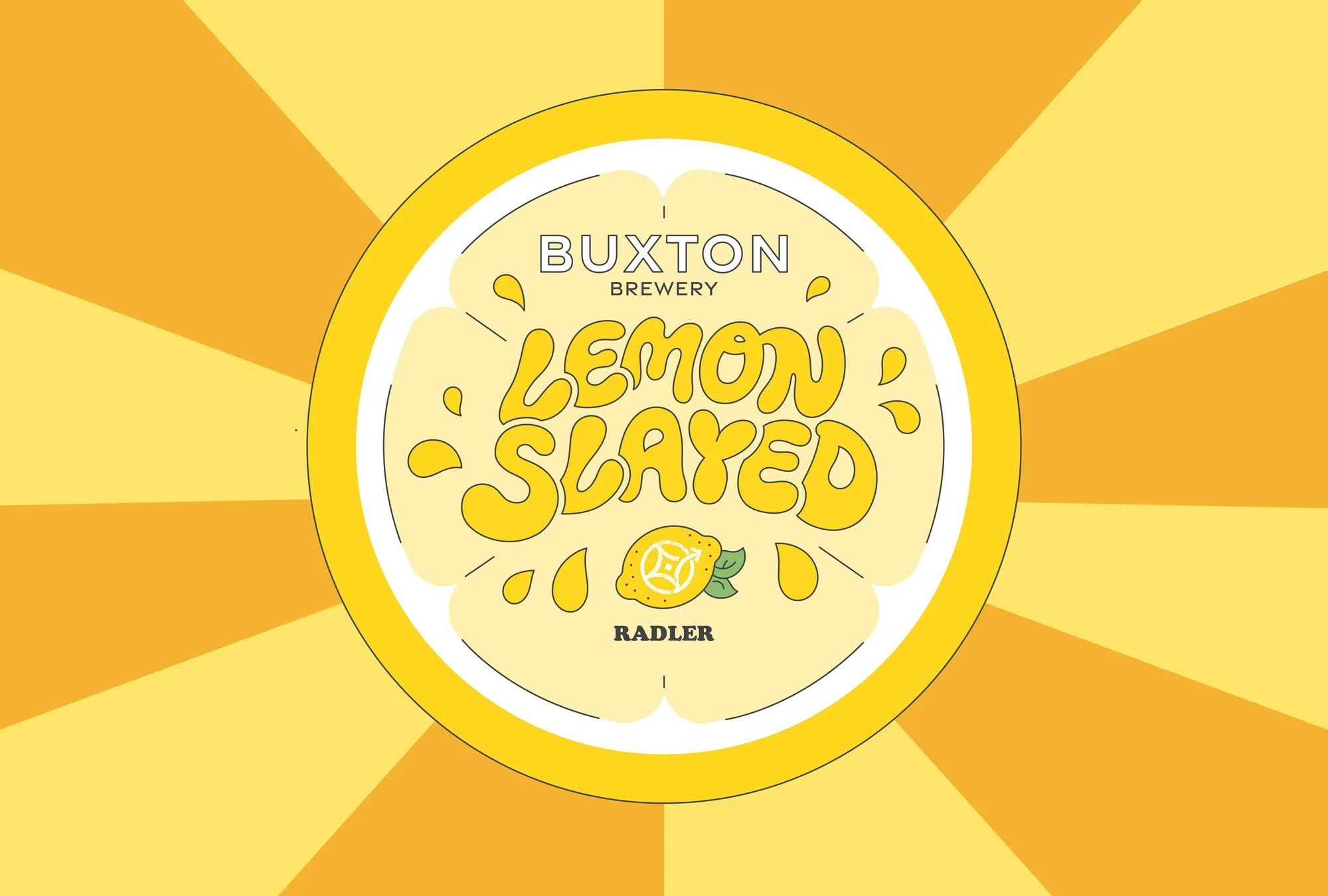
I illustrated a set of beer can designs for Buxton Brewery - Lemon Slayed, Green Acre & Wakin’ Snakes.
It was a blast to collaborate my illustrated world within Buxton’s signature cans with their white swipe at the top. Each of the cans includes subtle inclusions of the Buxton Brewery logo within the illustrations (see if you can spot them!) which all followed themes inspired by their flavours and where they originated.
Green Acre is a West Coast IPA collaboration beer between Buxton Brewery & Rooster’s Brewing Co. which was inspired by American Indian pale ales, reflected in its citrus orange & grapefruit & woody pine flavours. They wanted to represent the friendship of this collaboration through the characters in the scene which I brought to life through grapefruit and orange characters walking down the orange peel road. American road trips heavily inspired the feel of this can with the pine forest and rolling hills in the distance. American park signage also influenced the direction of typography we went for. We also wanted a nod to the locations of both breweries which are signposted on either side of the can in-between the pine trees, with the back of the label edged in a pine-tree inspired border pattern.


Lemon Slayed is a Radler beer which originated in the hills of Germany as a low alcoholic beverage combining Lemon soda and beer, commonly drank by cyclists who rode there - Buxton being set in the hills of the peak district felt an affinity towards this theme which is how the cyclist scene in the hills of the peak district came to be the cover of this beer. The title of the beer had to feel juicy and refreshing to match the summery vibe of the can, which led me to illustrate the juicy hand lettered type for the title. Subtle waves border the back of the design giving a nod to the theme of rolling hills.


The Wakin’ Snakes can illustration brings themes of the wild west inspired by this citrus American pale ale. This take on a classic American hop deserved a classic American scene for the illustration - dry deserts, cactuses and lots of snakes - each with their own playful personality. I wanted a beer to be entwined into the snakes on the front while other snakes emerged from cowboy boots or had snake skulls on the barren land. For this design I wanted the logo to be subtly hidden within one of the cactuses. For the title typography for this piece I was spoiled for choice with contemporary western inspired options, I liked a backdrop to the title which reminded me of old western films.
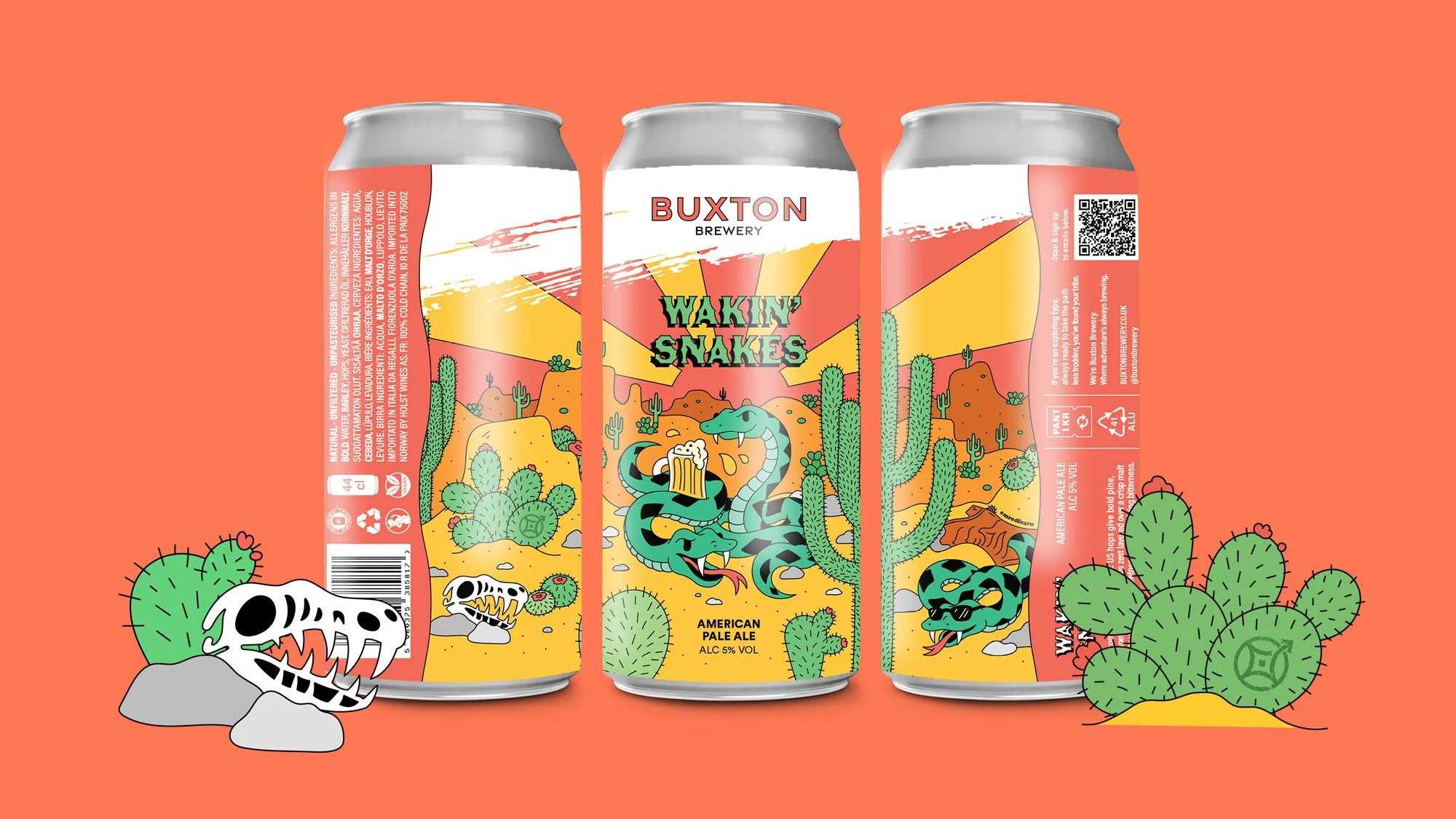

I wanted not only the front facing designs to reflect each of the can’s designs, but also the design of the back to as well. Each are bordered with a pattern that represents each can theme or flavour - The Wakin’ snakes can border on the back has a subtle wave like the shape of a snake’s body.
